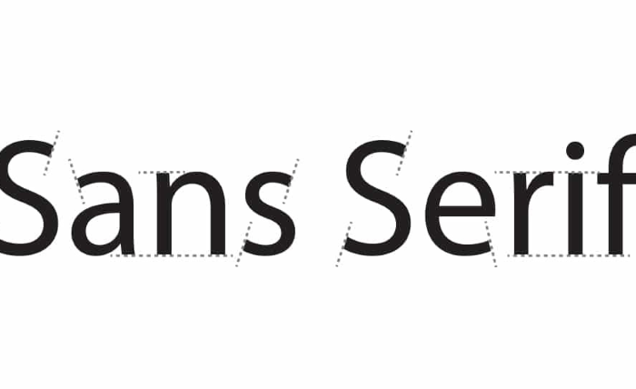
Why Sans Serif Fonts Are the Go-To for Clean Aesthetics
In the world of typography, trends come and go, but sans serif fonts have consistently remained a favorite especially when it comes to creating clean, modern designs. Their minimalist appeal and high readability make them a go-to choice for everything from websites and mobile apps to branding and advertising. But what exactly makes sans serif fonts so ideal for clean aesthetics? Let’s explore the qualities that give these fonts their lasting appeal in contemporary design.
Simplicity That Speaks Volumes
Sans serif fonts are defined by what they lack, namely, the small decorative flourishes (serifs) found at the ends of strokes in serif fonts. This absence of embellishment results in letterforms that are clean, uncluttered, and straightforward. Fonts like TT Norms® Pro exemplify this stripped-down elegance. Their geometric shapes and uniform line weights contribute to a refined, balanced look that doesn’t distract the viewer but instead supports clarity.
This simplicity is precisely why sans serif fonts are used so widely in digital interfaces. In user interfaces where quick comprehension is crucial, sans serif fonts allow users to focus on content without being overwhelmed by ornate details.
Digital-First Design Needs Clarity
In today’s digital-first world, legibility across multiple screen sizes is non-negotiable. Sans serif fonts tend to perform better on digital displays because their clean lines render more clearly, especially on lower-resolution screens. The widespread adoption of responsive design has further increased the demand for fonts that remain readable at various sizes, from smartphone screens to widescreen monitors.
Fonts like TT Interphases Pro specifically designed with digital clarity in mind. Their smooth curves, open counters, and consistent spacing enhance user experience by reducing eye strain and improving content digestion.
Versatility Across Industries
One of the standout features of sans serif fonts is their incredible versatility. Whether you’re designing a cutting-edge tech brand, a minimalist fashion label, or a professional services website, there’s a sans serif font to match the tone. For instance, TT Hoves Pro offers a wide range of font weights and styles. It allows designers to create hierarchy and emphasis without ever straying from a clean look.
Sans serif fonts adapt easily to a range of design contexts. Want a bold, commanding title? A heavier sans serif like TT Commons Pro Bold works beautifully. Need a light, elegant type for body text? TT Norms® Pro Light delivers clarity with grace. This flexibility makes sans serif fonts a practical choice for multi-purpose design systems.
Modern Appeal and Timelessness
Clean aesthetics are often associated with modernity, but sans serif fonts have also proven their timeless nature. From mid-century modern posters to 21st-century app interfaces, these fonts have appeared across decades of visual culture without ever seeming outdated. Their modern yet neutral tone makes them a blank canvas that designers can shape to match evolving visual identities.
This timeless quality also contributes to brand recognition. Many well-known companies like Google, Spotify, and Airbnb have embraced sans serif fonts in their logos and branding to signal innovation, accessibility, and forward-thinking values.
Psychological Impact of Clean Typography
Typography doesn’t just communicate words—it also conveys tone, trust, and personality. Studies have shown that sans serif fonts evoke feelings of honesty, simplicity, and modernity. Because they are free from excessive decoration, they are often perceived as more straightforward and transparent.
In marketing, this psychological association is powerful. Brands that use sans serif fonts often appear more user-friendly and progressive. This is particularly important in industries that rely on digital touchpoints, such as fintech, SaaS, and health tech, where trust and clarity are vital.
Conclusion
Sans serif fonts have earned their place as the go-to choice for clean aesthetics in modern design. Their simplicity, digital adaptability, and versatility make them indispensable tools for designers seeking clarity, professionalism, and a modern look. As trends shift and technologies evolve, one thing remains certain: the timeless appeal of sans serif fonts continues to shape the visual language of our digital world.